Five accessibility checks
Headings in order, alt text on images, readable contrast, link text that says where it goes, and no meaning carried by colour alone.
Why bother
Some of your readers use a screen reader, zoom the page to 300 percent, see colours differently, or are reading on a cracked phone in sunlight. Accessible documents work for all of them, and they are also clearer for everyone else. In many places it is also a legal requirement for anything you publish.
The good news: if you have followed lessons 1 to 3, most of the work is done. This lesson is the final check.
The five checks
| Check | Pass looks like | Fail looks like |
|---|---|---|
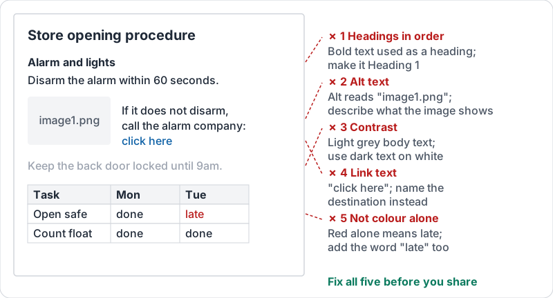
| 1. Headings in order | Title, then Heading 1, Heading 2 under it, no skipped levels | Bold 14-point text used as headings; Heading 3 straight after Heading 1 |
| 2. Alt text on images | Every meaningful image has a short description of what it shows | No alt text, or alt text that reads “image1.png” |
| 3. Contrast | Dark text on a light background (or the reverse) | Grey on white, yellow on white, light text on a photo |
| 4. Link text | “Read the refund policy” | “Click here”, “this link”, a pasted URL |
| 5. Colour is not the only signal | “Overdue (red)” or an icon plus a word | A table where red cells mean late and nothing else says so |
All five failures on one page.
Writing alt text
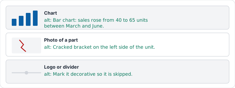
Alt text is read aloud in place of the image. Describe what matters for this document, in one sentence, without “image of”:
- A chart: “Bar chart: sales rose from 40 to 65 units between March and June.”
- A photo of a damaged part: “Cracked bracket on the left side of the unit.”
- A logo or decorative divider: mark it decorative so it is skipped.
Three examples of alt text that works, and the menu that sets it.
Link text
The link text should make sense on its own, because screen reader users often jump from link to link. “Click here” repeated six times tells them nothing. Write the link on the words that name the destination: “the November shift schedule”, “our returns form”.
Google’s accessibility team on why informative headings and titles matter to screen reader users.
Contrast and colour
Keep body text black or very dark on white. Avoid light grey “subtle” text; it is unreadable in sunlight. If you use colour to mean something in a table, add a word or symbol too, because about one in twelve men cannot tell red from green.
Try it now
Take a document you are about to share. Run the five checks in the table above and fix anything that fails. The most common fixes are: turn bold lines into headings, add alt text to one image, and replace “click here” with the destination’s name.
Remember: headings in order, alt text, contrast, link text, not colour alone. Five checks, two minutes, every time you share.
Checking your progress…